Chapter 11 Formatting Objects in Word
Vocabulary
Contextual tab: A hidden tab on the Office ribbon that becomes visible when a specific item is selected, or a certain task is done by the user. For instance, when a picture is selected, the Picture Format tab appears on the tab row.
Hover over: Moving the mouse pointer over an option without selecting it.
Saturation: Vividness of the color in an image.
Tone: A color or shade of color in an image; can be described as light or dark colors or warm or cool colors.
Transparent: Easy to see through.
Introduction
In Chapter 9, you learned how to insert hyperlinks, headers, and footers, which use the Insert tab ribbon. In Chapter 10, you learned to create, edit, and format tables, which are on the Insert tab. This chapter will describe how to insert and format objects, such as pictures, and how to work with text boxes and WordArt. These commands (buttons) are found on the Insert tab. Like in prior chapters, when working with different features, Word adds extra tabs, called contextual tabs, to the Ribbon and are normally not present. This chapter will also address contextual tabs related to inserting and formatting objects.
Insert Pages and Pictures Using the Insert Tab
In this section, inserting pages (using the Page Group commands) and inserting pictures (using the Picture command in the Illustrations group) will be discussed (Figure 1).

Pages Group
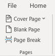
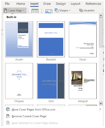
The Pages group on the Insert tab includes three options – cover page, blank page, and page break – that can be inserted (Figure 2A). The Cover Page button opens a gallery of cover pages for the user to select (Figure 2B). Using the Cover Page button, the user can select the cover page desired to be inserted into the document or remove an existing cover page from the document.
Inserting a Cover Page
To insert a cover page, click the Cover Page command (button) in the Pages group on the Insert tab. Scroll through the gallery and click the cover page desired (Figure 2B). The cover page selected will be inserted at the start of the document. The location of the cursor does not matter. After the cover page is inserted, the user can replace the sample placeholder text with their own text. If an additional cover page is added to the document, the initial cover page will be replaced.
Inserting a Blank Page and Page Break
To insert a blank page in a document, place the cursor where the new page should begin. Click Blank Page in the Pages group on the Insert tab. The blank page is inserted when the button is clicked.
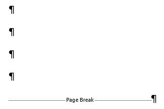
If the user wants content to be at the top of the next page, a page break can be inserted. To do this, place the cursor at the start of the content for the next page. Click Page Break located in the Pages group on the Insert tab. A page break will be inserted when the button is clicked. If the user clicks the Show/Hide button in the Paragraph group on the Home tab, the page break becomes visible (Figure 3).
Illustrations Group
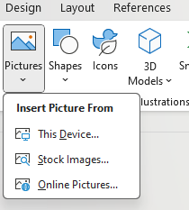
The Illustrations group provides the user with tools to insert pictures, shapes, icons, 3D models, Smart Art, Charts, and Screenshots (Figure 4).
Inserting Pictures
When inserting a picture in a document, the user can choose to insert a picture from their device, using stock images, or online pictures.
To insert a picture from the drive, place the cursor in the location where you wish to insert the picture. Click the Pictures command (button) in the Illustrations group on the Insert tab. Select This Device. The Insert Picture dialog box appears. Navigate your folders to find the picture on your drive. Select the image and click the Insert button. The picture will be inserted into the document.
To insert a picture using a stock image or an online picture, the same steps are followed. Click the Pictures command and select either a stock image or online picture. Select the picture and click the insert button.
Resizing Pictures
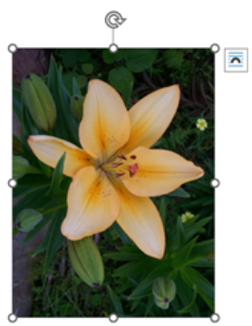
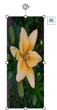
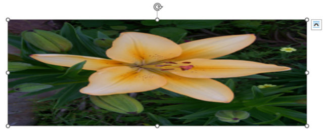
To resize the picture, click and drag the corner sizing handle. This will increase or decrease the size of the picture while keeping the same proportions (Figure 5A). If the user were to use the side sizing handles, this would change the proportions and vertically or horizontally stretch or shrink the image (Figures 5B and 5C).
Picture Format Tab
In the prior section, inserting a picture was discussed. When a picture in a document is selected, the Picture Format tab appears on the Ribbon. The Picture Format tab is a contextual tab. This section will describe commands and features available to the user using the Picture Format tab (Figure 6).

Adjust Group
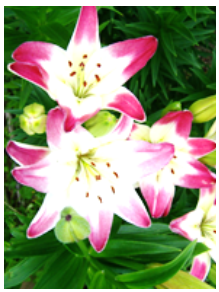
The Adjust group changes the appearance of the picture (Figure 7A). The commands in this section are as follows:
- Remove Background: After the user indicates the areas to keep, the command will remove the unwanted sections of the picture.
- Corrections: Used to address the contrast, brightness, or sharpness of the picture (Figure 7B).
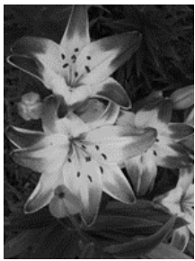
- Color: Used to change the saturation or tone, or to recolor the image (Figure 7C).
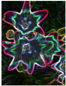
- Artistic Effect: Used to make the picture appear more like a sketch or painting (Figure 7D).
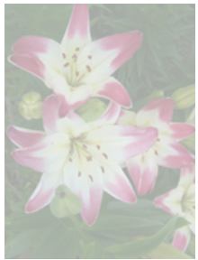
- Transparency: Used to create a transparent image so that whatever is behind the picture can be seen (Figure 7E).
- Compress picture: The user can select from several compressed sizes for the picture.
- Change picture: Allows the user to change or remove the picture.
- Reset picture: Removes all the formatting applied to the picture.
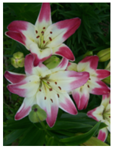
To use the features in this group, select the picture. Click the desired command. Hover over the options to preview them. Click the option desired. To reset the picture, select the picture and select Reset picture command.
Pictures Styles Group
The user can utilize options in the Picture Styles group to transform pictures. This group includes the Quick Styles gallery, Picture Border, Picture Effects, and Picture Layout.
Quick Styles
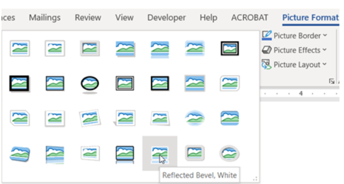
The Quick Styles gallery contains predefined styles for a picture. The user can hover over a style to see how it changes the picture. The name of the style will appear. For additional styles, click the More button (indicated by the drop-down arrow in the lower corner) (Figures 8A and 8B). Click the desired style to apply to the picture.

Picture Border
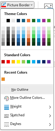
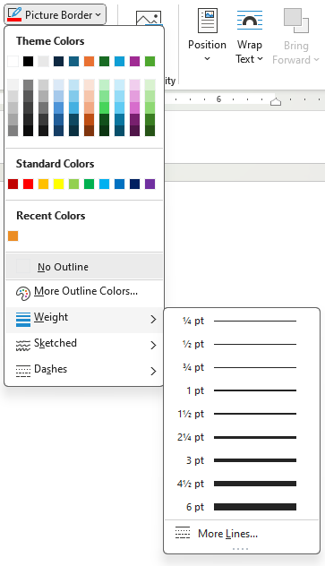
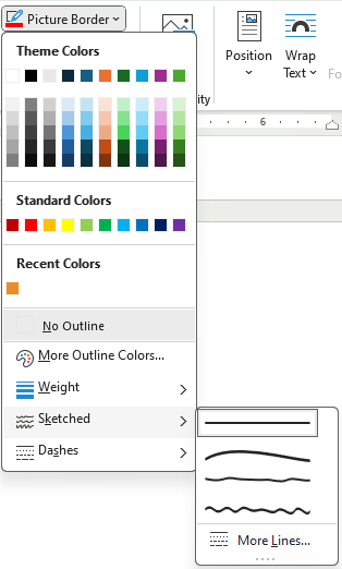
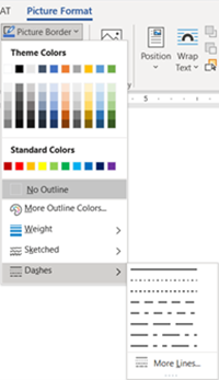
When the user clicks on the Picture Border command (button), the Border menu appears (Figure 9A). The Theme color changes with the theme applied to the document. The More Outline Colors shows colors much like the Font Color menu discussed in a prior chapter. The user can select the weight (thickness) and appearance of the border lines (Figures 9B – 9D).
To use the Picture Border button, follow these steps:
- Select a picture to edit. To apply the same effect on multiple pictures at once, click the first picture and hold the CTRL key while clicking on the other pictures. (If the CTRL key does not work, change the Layout Options of the pictures to a With Text Wrapping option. See the Arrange Group section for more details.)
- Click Picture Border command in the Picture Styles group on the Picture Format tab.
- Select the desired options for color, weight, and line appearance.
Picture Effects
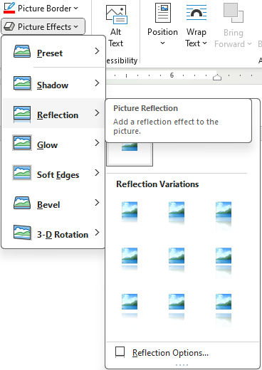
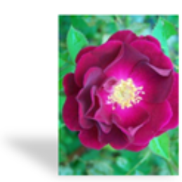
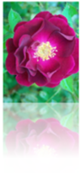
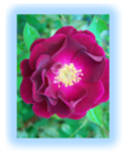
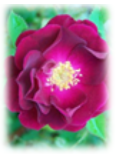
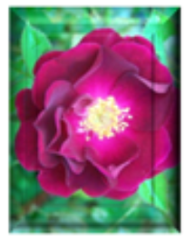
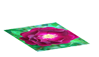
The Picture Effects button allows the user to change the appearance of a picture. When the button is selected, a menu appears (Figure 10A). The user can select a shadow, reflection, glow, soft edges, bevel, or 3D rotation effect (Figures 10B – 10H). When the user clicks on a selection, an additional submenu appears with additional options.
To use the Picture Effects command, follow these steps:
- Select picture to edit. To apply the same effect on multiple pictures at once, click the first picture and hold the CTRL key while clicking on the other pictures. (If the CTRL key does not work, change the Layout Options of the pictures to a With Text Wrapping option. See the Arrange Group section for more details.)
- Click Picture Effect in the Picture Styles group on the Picture Format tab.
- Hover over the options in the menu to see how they change the picture(s). Select the desired option.
To remove an effect, click on the picture. Click on the Picture Effect command on the Picture Format tab. Select the effect you wish to delete and when the submenu appears, click on the “No” effect (e.g., No reflection).
Picture Layout
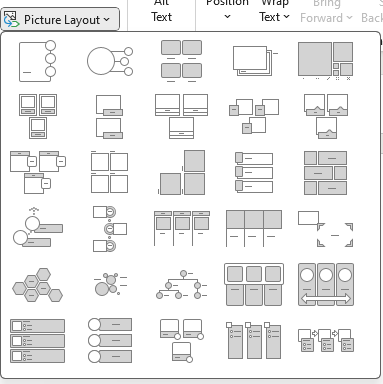
The Picture Layout command provides the user with a menu of preset layouts to use with multiple pictures (Figure 11). These steps will help you use this feature:
- Select the pictures. Click the first picture and hold the CTRL key while clicking on the other pictures. (If the CTRL key does not work, change the Layout Options of the pictures to a With Text Wrapping option. See the Arrange Group section for more details.)
- Click Picture Layout in the Picture Styles group on the Picture Format tab.
- Select the desired layout.
Arrange Group
The Arrange group has commands (buttons) that help the user position objects (Figure 12A). The Arrange group contains the following:
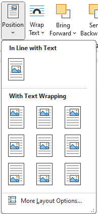
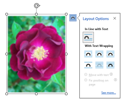
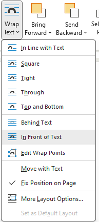
- Position: Allows the user to change how the picture interacts with other pictures and text. When the Position button is selected, the Layout Menu opens (Figure 12B). This menu is also available if the user clicks on the Layout Options box to the upper right of the picture (Figure 12C). When a picture is added to a document, the default position setting is In Line with Text. This limits the ability to move the image and to select multiple pictures at once. Changing the picture to a With Text Wrapping option allows the user more flexibility with the position of the image.
- Wrap Text: Provides the user with additional wrap text options (Figure 12D).
- Bring Forward and Bring Backward: Moves the selected picture either in front of or behind another object.
- Selection Pane: Provides a list of the pictures.
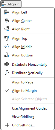
- Align: Allows the user to align and position the picture on the page (Figure 12E).
- Group: Joins two or more objects together so the user can move and format them as one object.
- Rotate: Rotates the object 90 degrees left or right or flips the object horizontally or vertically.

Size Group
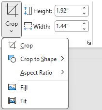
The Size group allows the user to change the size of the object or crop (remove) part of it (Figure 13A). To use the sizing tool, select the object and change the height or width of it by typing in the number or using the arrows.
The cropping features allow the user to do multiple things.
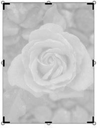
- Crop: To crop a picture, select the picture and click the Crop button in the Size Group or click the drop-down arrow under the Crop button and select Crop (the top menu item) (Figure 13A). Use the cropping handles to resize the image (Figure 13B). Click the Crop button when you are done.
-
- To crop one side of the picture: Drag the side cropping handle inward.
- To crop two adjacent sides at the same time: Drag the corner cropping handle inward.
- To crop equally on two parallel sides of the picture at once: Press and hold the CTRL key while dragging the side cropping handle inward
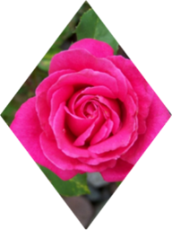
- Crop to Shape: To crop a picture to a specific shape, select the picture (Figure 13C). Click the Crop drop-down arrow and select Crop to Shape. Select the shape and immediately the picture is cropped to that shape. The Fill button can be used to fill the entire shape with the picture. The Fit button can be used to make the entire picture fit within the shape, while maintaining the aspect ratio.
Inserting Illustrations Using the Insert Tab
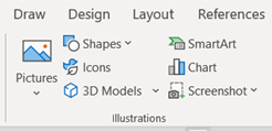
In this section, inserting shapes, icons, 3D models, SmartArt, Charts, and Screenshots will be discussed. These commands are found with the Pictures command in the Illustrations group on the Insert tab (Figure 14).
Shapes and the Shape Format Tab
Shapes can be found in two locations – in the Illustrations group on the Insert tab and in the Insert Shape group on the Shape Format tab. Using the Shapes button, the user has a choice between eight categories of shapes from the gallery. These include lines, rectangles, basic shapes, block arrows, equation shapes, flowcharts, starts and banners, and callouts (Figure 15A).
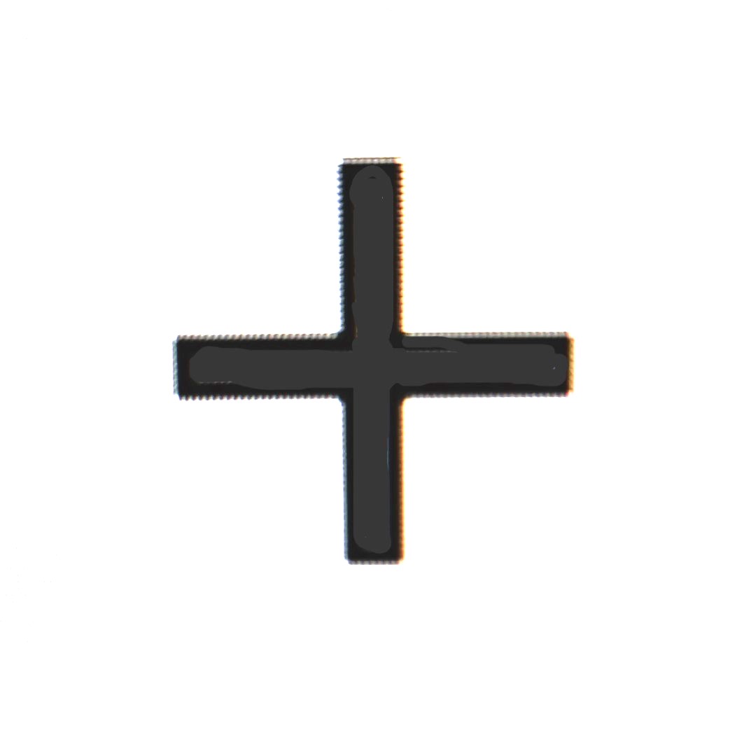
When the user selects a shape, a crosshair pointer allows the user to draw the shape in the document using the mouse or touchpad (Figure 15B). Once the shape is created, the Shape Format tab appears on the Ribbon and provides additional options to format the shape (Figure 15C).


When the shape is selected in the document, the Shape Format contextual tab appears on the tab row (Figure 15C). This tab includes the following groups and commands:
- Insert Shapes group: Allows the user to add and edit shapes, along with text boxes. Text boxes are boxes where content can be typed. The Text Box command is also found on the Insert tab in the Text field.
-
- To create a text box, click the Text Box command. A crosshair pointer appears and allows the user to draw the text box shape using the mouse or touchpad. Once the box is created, characters (e.g., numbers and letters) can be typed in the box.
- Shape Styles group: Provides options for the user to change the color of the shape, including the fill and outline. The Shape Effects command can also be used to add more interest in the appearance of shapes. The commands in this group are similar to those in the Picture Styles group in the prior section.
- WordArt Styles group: Provides the user with a text style gallery. WordArt styles include decorative effects, such as shadowed, reflective, and curved text options. WordArt becomes an object when added to a document. (Additional information on WordArt Styles is provided in the next section.)
- Text group: Allows the user to change text direction and alignment. Links can also be inserted.
- Accessibility group: Appears on many contextual tabs. The commands in this group allow the user to apply changes that increase the accessibility for those using screen readers.
- Arrange group: Allows the user to position the image with other images and text. The commands in this group are similar to those on the Picture Format tab.
- Size group: Allows the user to change the size of the shape.
WordArt Styles Group
The WordArt Styles group appears on the Shape Format contextual tab, but also can be accessed using the Text group on the Insert tab (Figures 16A and 16B). If the user draws a text box, all of the commands in the WordArt Styles group are active and can be used. If the user draws other shapes, only the Text Effects command is active. Once words are typed into the shape, additional commands in the WordArt Style group are active.
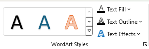
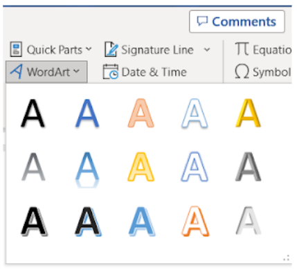
To insert using this command on the Insert tab, the user can select a style from the dropdown menu. A box will appear in the document showing “Your Text Here” (Figure 16C). Type the text in the box. The user can also change the font characteristics (e.g., font type, size, and bold). The box can be moved on the page, and the size can also be adjusted.
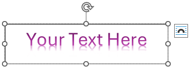
When the user is working on a WordArt object, the Shape Format contextual tab appears in the tab row. By using the commands in the WordArt Styles group, the user can select another format, add fill to outline WordArt styles, change the color of the outline, and add effects.
To delete WordArt, select the object and press the Delete key.
Icons and the Graphic Format Tab
The Illustrations group includes a command (button) to insert icons. Stock icons are available and are also free, with no copyright (Figure 17A). The icons can be resized, formatted, and moved in the document (Figure 17B).
To insert an icon, select the Icons command in the Illustrations group on the Insert tab. The Stock Image dialog box appears and allows the user to search for stock online icons. Type a word or phrase in the search bar or click the subject areas (e.g., icons, stickers) to narrow the search. Scroll through the images and click on the desired icon. Multiple icons can be selected by just clicking on the images. Click the Insert button in the lower right corner of the dialog box.
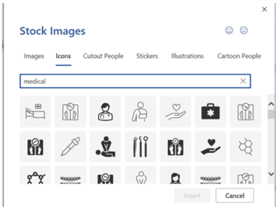

When an icon is selected in the document, the Graphic Format tab, a contextual tab, appears on the tab row of the Ribbon (Figure 17C).
- Change group: Allows the user to change the graphic to a stock or personal icon. The user can also change the graphic to a picture. By changing it to a picture, the Picture Format tab replaces the Graphic Format tab on the Ribbon.
- Graphic Styles group: Provides options for the user to add color, fill, lines, and effects to the icon.
- Accessibility group: Allows the user to type text describing the image for increase accessibility.
- Arrange group: Allows the user to position the image with other images and text. The commands in this group are similar to those on the Picture Format tab.
- Size group: Allows the user to crop the graphic or change the size.

Figure 17C. Graphics Format contextual tab.
3D Models and the 3D Model Tab
The Illustrations group includes a 3D Models command (button). A 3D image can be rotated, showing all of its angles. Clicking the drop-down arrow next to the 3D Model button allows the user to select a 3D model from their files or an online 3D model. Clicking the 3D Model button will bring up the online 3D model search box (Figure 18A).
To insert a 3D model, place the pointer where the model should be located. Click on the Insert tab and select the 3D Models button or drop-down arrow from the Illustrations group. To browse the online 3D models, type in a search word or phrase. Scroll and review the images shown. Select an image and click Insert. When the inserted image is selected, the user can use the control in the center of the picture to rotate the image (Figure 18B).
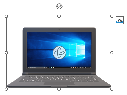
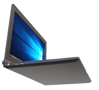
When the 3D image is selected in the document, the 3D Model contextual tab will appear on the tab row (Figure 18C). The contextual tab contains several controls that allow the user to customize the 3D image. Commands and features on this tab include the following:
- Adjust group: Allows the user to add additional 3D models or reset the current 3D model.
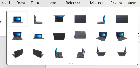
- 3D Model View group: Allows the user to select another angle of the 3D model. By clicking the More button, the gallery of images appears (Figure 18D).
- Accessibility group: Allows the user to type text describing the image for increase accessibility.
- Arrange group: Allows the user to position the image with other images and text. The commands are similar to those found on the Picture Format tab.
- Size group: Allows the user to pan, zoom, and change the size of the image. The Pan & Zoom button provides the user a way to click and drag the image within the frame to move it. The Zoom arrow on the center right side of the image makes the image shrink or enlarges the object within the frame.

SmartArt and the SmartArt Design Tab
When the user clicks on SmartArt in the Illustrations group on the Insert tab, the Choose a SmartArt Graphic dialog box appears (Figure 19A). Categories of shapes are listed on the left side of the box.
To use SmartArt graphics, place the pointer in the document where the graphic is to be placed. Click on the SmartArt command (button) in the Illustrations group on the Insert tab. When the Choose a SmartArt Graphic dialog box appears, select a graphic and click OK. To enter text in the text fields, click [Text] in the Text pane and type the text (Figure 19B).
When a SmartArt graphic is created, two additional tabs appear on the Ribbon – SmartArt Design and Format.
- SmartArt Design tab: Allows the user to modify the graphic by adding additional shapes, changing the layout and colors, and resetting the graphic (Figure 19C).
- Format tab: Provides the user with options to change the color, fill, and effect of the graphic and text (Figure 19D).
To add or delete shapes in the graphic, the user can do the following:
- Use the Text Pane: To add a shape, position your cursor in the Text pane at the end of the word that comes just before the location for the new shape. Press the Enter key, creating a new bullet. To delete a shape, place the cursor next to the bullet to be deleted and press the Delete key.
- Use the SmartArt Design tab: Click the graphic and select the existing shape closest to where the new shape needs to be added. Using the SmartArt Design tab, select the drop-down arrow to the right of the Add Shape command in the Create Graphic group. Select either Add Shape After or Add Shape Before.
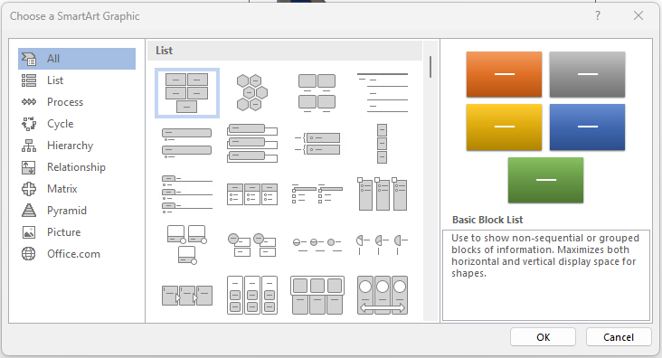
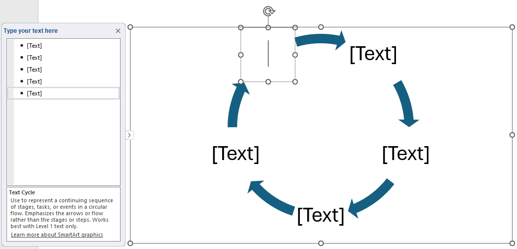


Chart and the Chart Design Tab
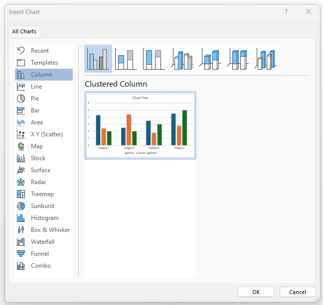
In the Illustrations group, the Chart command (button) can be used to create a chart. When the Chart command is selected, the Insert Chart dialog box appears (Figure 20A). The user can select the type of chart to be inserted on the left side of the box. Variations of the selected chart appear at the top of the box for the user to select. When the desired chart is selected, press OK.
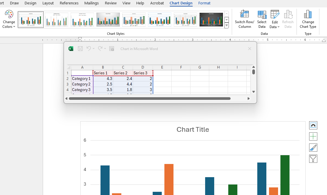
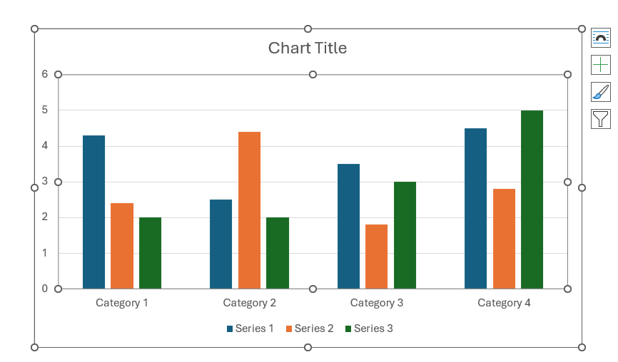
The chart is inserted in the document, and an Excel spreadsheet appears (Figure 20B). The user can enter the data into the spreadsheet, and the changes will appear in the chart. Columns can be deleted or added. Labels can be added to clarify the data (see Figure 20C).
When inserting a chart, the Chart Design contextual tab appears on the Ribbon (Figure 20D). By using the features and commands on this ribbon, the user can modify the chart’s color, data, type, and other characteristics.

Screenshot
The user can add a screenshot to the document using the Screenshot command in the Illustrations group on the Insert tab. The dropdown menu shows screen clips that can be inserted, along with a screen clipping tool. This tool allows the user to take a screenshot of a portion of the screen.
Apply a Theme to a Document
A theme is a unique group of colors, fonts, and graphics that are coordinated. The user can apply a preset theme or customize a theme.
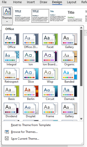
To apply a theme, select the Design tab and click on Themes on the far-left side of the Ribbon (Figure 21A). When the user hovers over a theme, it is temporarily applied to the document. The user can scroll through gallery of themes and click on the desired theme to apply it to the document (Figure 22A).
To change the theme colors, select Colors on the Design tab. Hover over a color scheme to see how the color impacts your document. Select a color scheme.
To change the font, select the Fonts command on the Design tab. Hover over a font type to see how it changes your document. Select a font type.

Learning Activities
Formatting Objects in Word – Flash Cards
Application Exercise
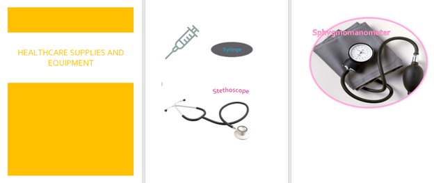
Directions: Create a three-page document related to a topic of your choice.
- Open a new MS Word document and save it as: Exercise 11 1
- Select a topic of your choice. (The topic used in the example is equipment and supplies used in healthcare.)
- Press the Enter button three times.
- Insert an icon based on your topic. Once the icon appears in the document, select the icon. Using the Graphics Format contextual tab, change the color of the icon. Use a color of your choice.
- Insert a 3D model based on your topic. When the model uploads, use the 3D Model contextual tab and select a 3D Model View of your choice.
- Next to the inserted icon, insert a shape. Change the fill to match the color of the icon. Inside of the space, insert a text box and type in the name of the icon. Change the font size to at least a 16 pt.
- Select the text box and using the Shape Format contextual tab:
-
- Select a desired Word Art style.
- Select a desired Text fill color.
- Using the Shape Fill command in the Shape Styles group, select No Fill.
- Using the Shape Outline command in the Shape Styles group, select No Outline.
8. Using Word Art on the Insert tab, insert a Word Art box above the 3D model picture. Type the name of the picture. Using the Shape Format contextual tab, select the Text Effect command and select the Transform option. Select a desired Follow Path option.
9. Insert a cover page. Select the Banded cover page. Click on the Document Title field and type a title that summarizes your selected topic.
10. Double-click in the white space below the 3D model picture. Insert a page break.
11. On Page 3, insert a picture of your choice based on your topic.
12. Select the picture and crop the background, using the Crop command on the Picture Format contextual tab. Then, use the Crop to Shape command, select a desired shape.
13. Select the picture. Using the Picture Effects command on the Picture Format contextual tab, apply an effect of your choice.
14. Resize the picture so it fills the width of the page.
15. Using the Word Art command on the Insert tab, select a desired style and type a title for the picture. Place the title box over the picture. Tip: You may need to click the Layout options box to the upper right of the picture and select “Fix position on page.”
16. Apply a theme to the document. (The colors may change when the theme is applied.)
A hidden tab on the Office ribbon that becomes visible when a specific item is selected, or a certain task is done by the user. For instance, when a picture is selected, the Picture Format tab appears on the tab row.
Vividness of the color in an image.
A color or shade of color in an image; can be described as light or dark colors or warm or cool colors.
Easy to see through.
Moving the mouse pointer over an option without selecting it.

